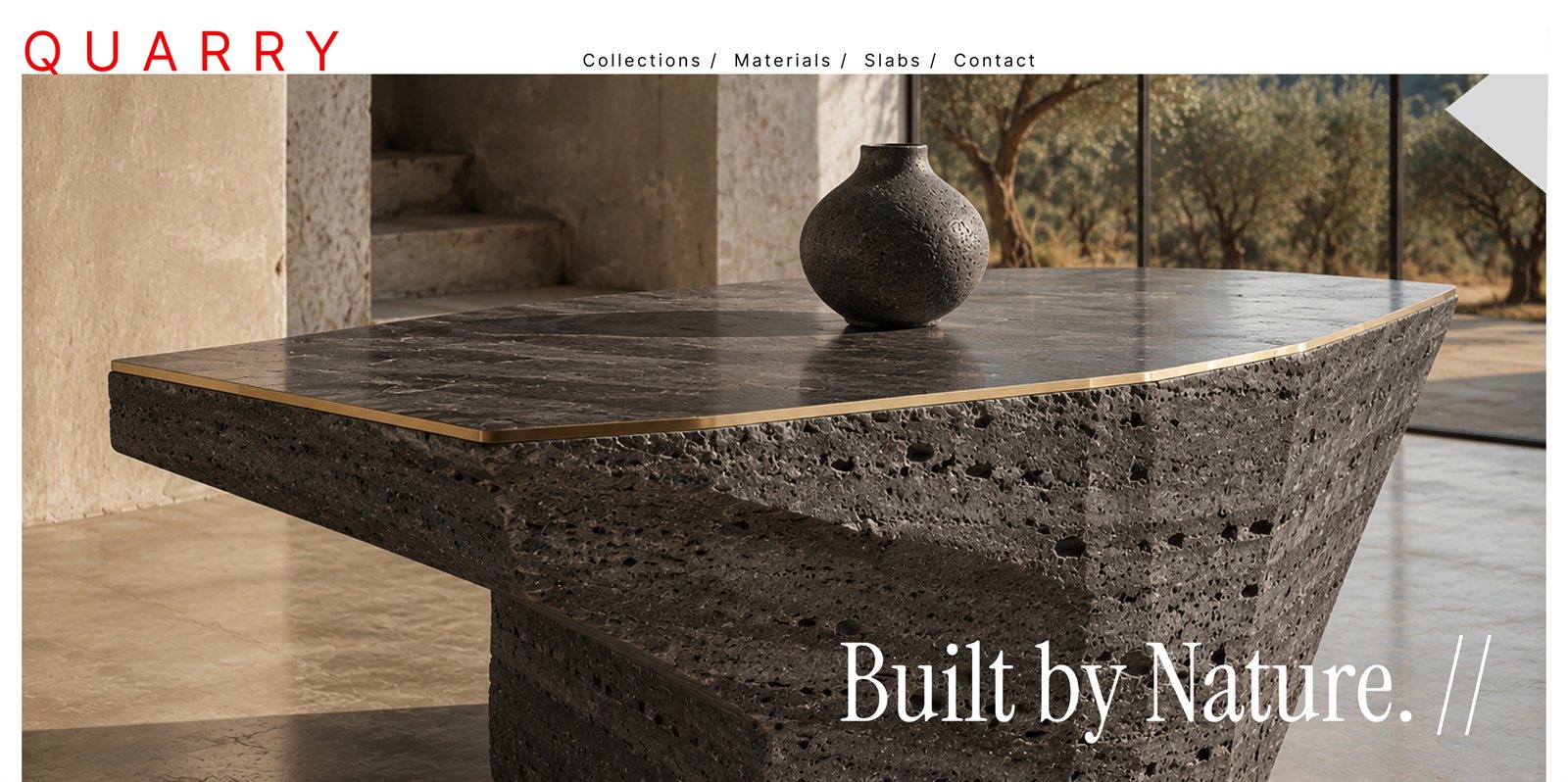
A quiet-luxury identity & website for designed heat.
An editorial, quiet-luxury website for a high-end maker of heating objects — fireplaces engineered to belong to the architecture, not to sit beside it.
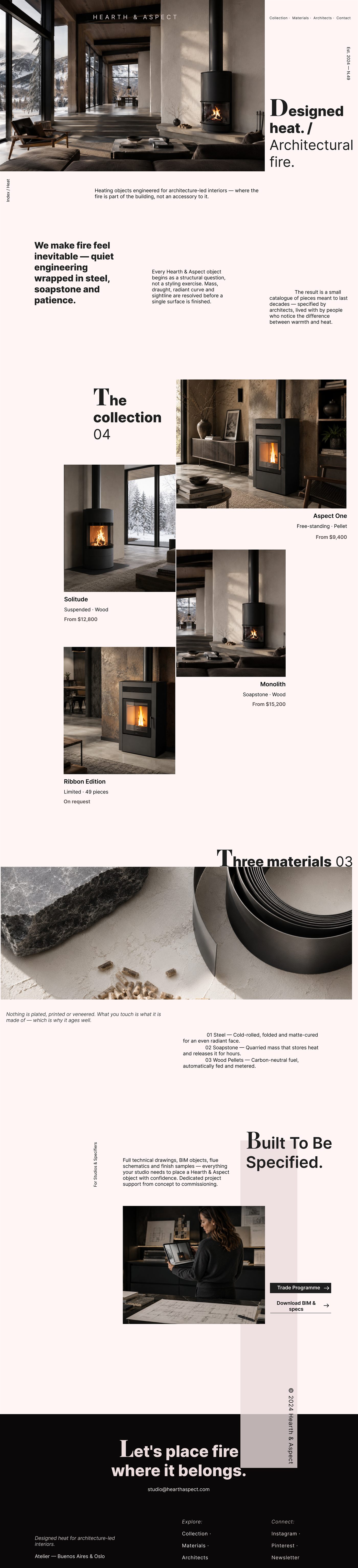
The full home page — scroll inside the frame to explore it.
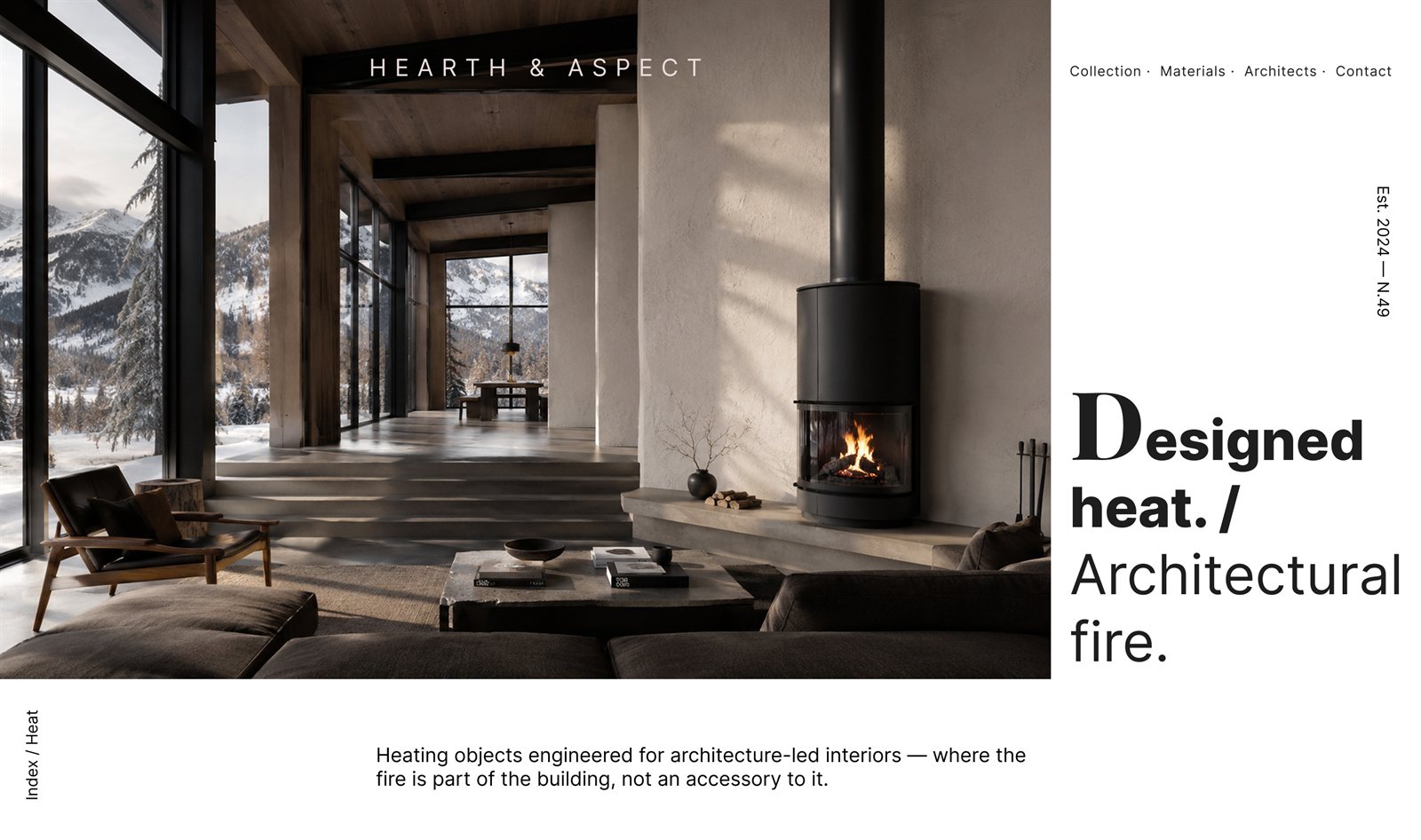
Hearth & Aspect designs heating objects for architecture-led interiors — where the fire is part of the building, not an accessory to it. The challenge was to translate that engineering-first, materials-honest philosophy into a digital experience that reads like an editorial magazine rather than an ordinary website.
The result is a restrained, high-ticket visual system: massive typographic contrast, near-monochrome UI where colour comes only from photography, and macro-whitespace that forces the visitor to slow down and look.
Playfair Display appears only as the dropped capital — the first letter of each headline. Everything after it, and the whole interface, is Inter. A single serif capital against a grotesque body is what builds the editorial tension.
A blush-white canvas and a near-black ink, warmed by ember browns. The interface stays silent so the photography can speak.
Each piece gets its own page — large imagery, specifications, materials and the trade information architects need, all in the same editorial language as the home.
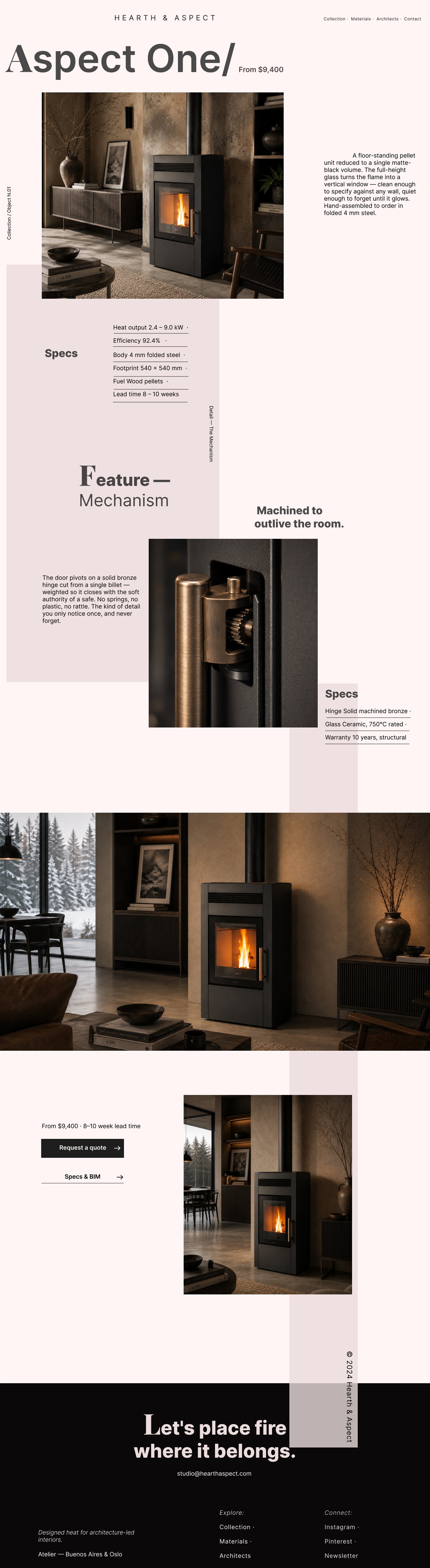
A product detail page — scroll inside the frame to explore it.
Let’s place fire
where it belongs.